Mobile-first fundraising platform at scale

the brief
Buy a Meeting is a Ukrainian charity auction that has raised funds for children’s rehabilitation since 2014. Participants offer experiences as lots, while others place bids to support the cause.
Problem
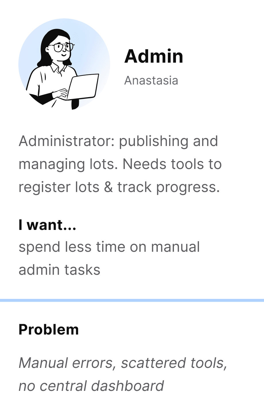
The auction relied on an 11-step manual process across Facebook, direct messages, Google Forms, and Excel. Managing 150 lots already required more than 40 hours of administrative work, making further growth impossible without expanding the team. Buyers also struggled to discover relevant lots, follow bids, and receive timely updates.
Solution
I helped transform the social-media auction into a mobile-first fundraising platform. The new experience brought lot registration, discovery, bidding, payments, and auction management into one connected system.
Result
Delivered a complete mobile and web platform with an admin workspace, doubling auction capacity from 150 to 300 lots. Buyers found relevant lots in under 30 seconds, while guided templates improved successful registration from 3 of 7 to 6 of 7 users.
Onboarding: introducing the mission and key ways to participate
CONTEXT & CHALLENGE
The auction had grown through Facebook, but the workflow had not evolved with it. The challenge was to connect buyers, lot owners, and administrators in one scalable experience while keeping participation simple, transparent, and personal. The solution also had to work within the nonprofit’s limited resources and existing team capacity.
DISCOVERY & DIRECTION
Understanding the ecosystem
What research revealed
The operational workload was only one side of the problem. Buyers could not easily browse or compare lots. Lot owners were unsure how to describe their offers. Participants also needed evidence that the auction was legitimate and that previous donations had created real impact.
Product direction
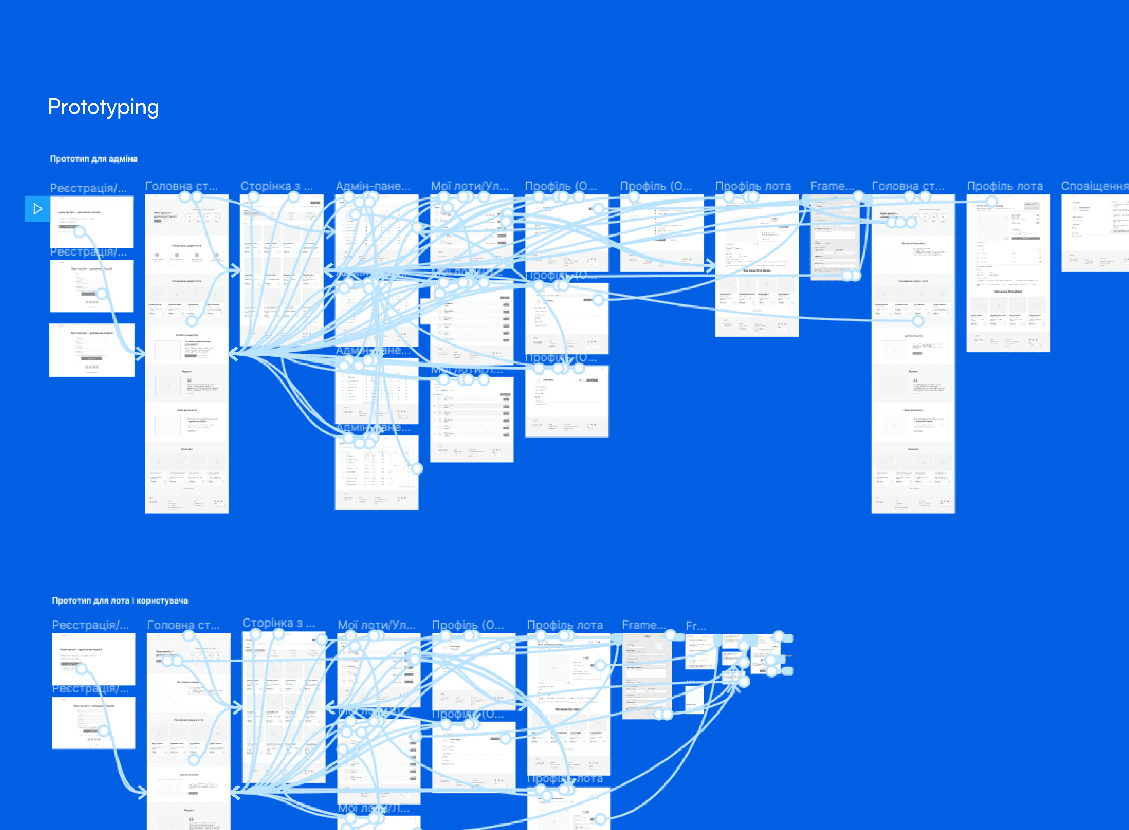
We moved from a collection of disconnected tools to a single platform supporting the complete auction journey. This direction reduced manual coordination while giving each participant greater visibility and control.
register a lot
discover opportunities
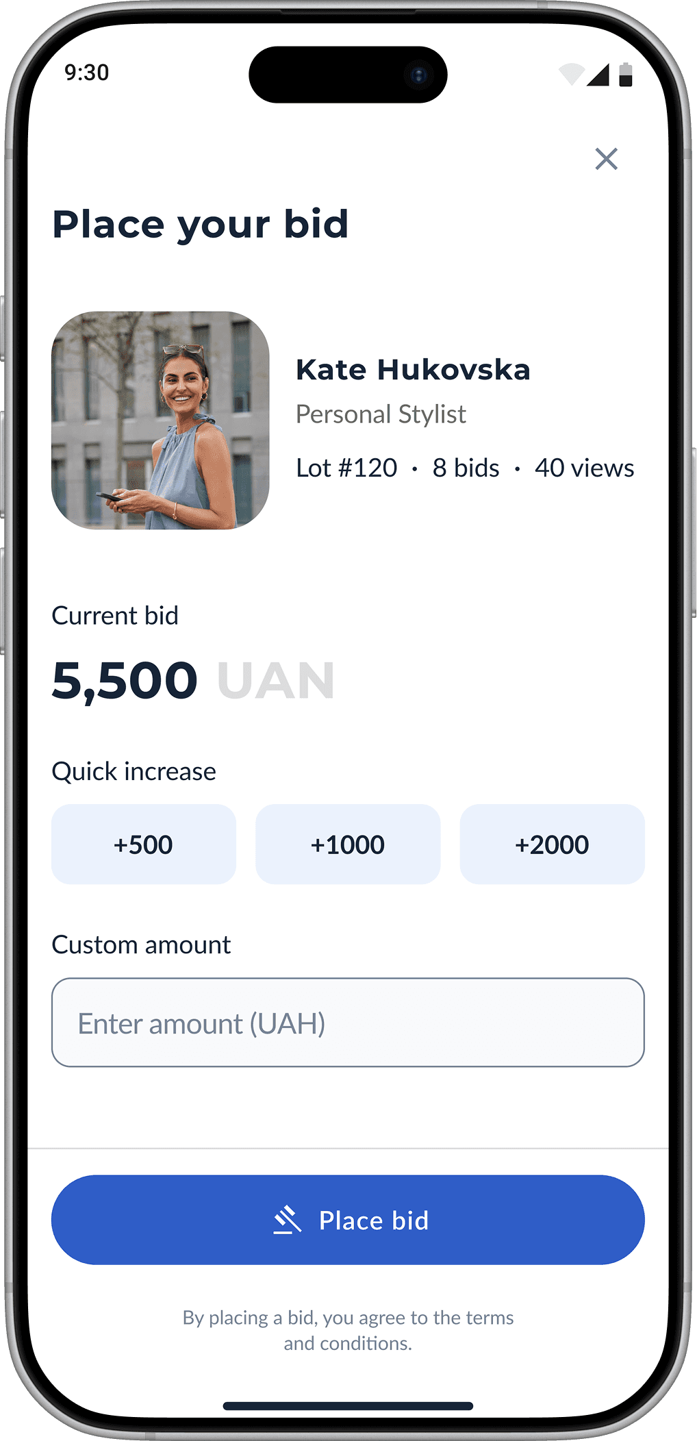
place a bid
track the outcome
complete the donation


KEY INSIGHTS
Mobile was the primary experience. Around 70% of bidding happened on mobile, making mobile-first design essential rather than optional.
Discovery broke at scale. A chronological Facebook feed worked for a small auction but became difficult to navigate as the number of lots increased. Search, filters, and structured categories were required to support growth.
Examples worked better than instructions. Lot owners often knew what they wanted to offer but were unsure how to describe it. Templates and examples made registration easier than adding more explanatory text.

Homepage: new lots surfaced daily to keep discovery active
VALIDATION & ITERATION
Key learnings from users
We tested the core registration and discovery workflows with lot owners and buyers before development. Instead of validating only task completion, we observed where users hesitated, what information they expected, and how they searched for relevant lots.


what did not work
Blank registration form. We initially tested open fields to keep registration flexible. Lot owners were unsure what to write and often needed help, so we introduced templates. Successful completion increased from 3 of 7 to 6 of 7 participants.
Search-only discovery. The first concept relied mainly on search. Testing showed that buyers often browsed by experience type rather than searching for a specific lot. We added categories, filters, and sorting, helping users find relevant offers in under 30 seconds.
Solution
Guided lot registration
Structured templates and examples replaced the blank submission form, helping lot owners create complete and consistent listings


Lot details: bid, countdown, and context in one view
Browse all lots: search and filters simplify discovery


Outcome
One connected platform. The redesign established a scalable foundation for the auction while preserving the trust and personal participation that made the initiative successful.
Past auctions: verified impact builds trust before bidding
Lessons learned
Validate before committing. Early testing challenged the initial Kanban direction before development. Evidence helped us invest in the problem users actually had, not the solution we assumed they needed.
Use data to challenge assumptions. Behavioral data showed where users dropped off, while interviews and usability testing explained why. Combining both gave me stronger evidence for product decisions.
Pre-launch validation mitigates risk. Testing before development revealed critical usability and trust gaps while they were still affordable to fix. The Past Auctions page showed that real results built more trust than marketing messages.
Next cases


